Saturday, May 14, 2011

"What did you do, Ray?!" --- "...it's the Stay Puft Marshmallow Man."

This will be a quick session regarding Scale Confusion, which is what happens when an object, figure or other element in the design is scaled in such a way as to create a juxtaposition to the other elements. See below.

Admittedly, the above paragraph could have been worded better.

The giant baseball bat in this image will jar the viewer due to it's size difference in contrast to the small people walking around it. (Unless you frequent Louisville and have since become desensitized to it.)

This effect is used to create dynamic designs and works of art that surprise or catch the attention of the viewer.


The cockroach in the bed is huge. Or, perhaps the bed and room are actually quite small, complete with microscopic shoes and books. In either event, this type of artistic device can be useful, and has been implemented in many art forms, from painting to advertising, to catch the attention of viewers.

---------------------------------------------------------------------------------
"Ray, when someone asks you if you're a god, you say 'Yes'!"

Honey, You're Not Out of Shape, You're Just Curvilinear

This session we'll be covering a myriad of terms involved with shape. This will be a large, long post, mostly rectangular, so let's jump right into it. Here's the rundown.

-Nonobjective Shapes
- Rectilinear Shapes
- Curvilinear Shapes

We'll also cover some aspects within art styles that involve variations on shape and proportion. These are below.

- Naturalism
- Idealism
- Abstraction
- Distortion

--------------------------------------------------------------------


The image below contains only Nonobjective shapes, shapes with no reference and no subject matter suggestion. Nonobjective shapes can be rectilinear or curvilinear in nature.
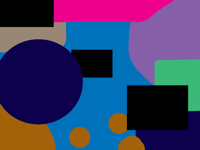
No suggestion to subject matter, no focal point, nothing. It's as if the artist put forth no thought into making it whatsoever.

The next image consists of shapes that are Curvilinear, or dominated by curves. Many forms in nature tend to be curvilinear

.

Finally, designs that are dominated by rectangles and squares and sharp edges tend to be classified as Rectilinear. Below is an architectural design by Frank Lloyd Wright, called Fallingwater. The rectilinear design he chose for this house juxtaposes against the natural organic shapes of the nature around it, creating a dynamic atmosphere.


This has been a quick overview of types of shape.

----------------------------------------------------------------------------
----------------------------------------------------------------------------


Next, we will discuss a few Isms.

Within the realm of art, there has been a need to accurately represent the world around us. Therefore, the ability to reproduce the natural world was intensely important in early art, and this style of art is called Naturalism.
. Naturalism is achieved when an artist faithfully and accurately reproduces the shape, color, proportions, etc of figures, forms, or other objects found in the world. Take a look at the painting below. 


The sheep have been as accurately portrayed as possible.


When an artist starts to step away from Naturalism and depicts things not as they are, it is normally through a type of distortion. Many works of Picasso involve distortion. Distortion is also the tool of caricature artists.

Above, the characteristics of the figures face have been distorted to convey certain aspects.


-
-
There is a specific type of distortion called Abstraction, which implies a simplification of natural shapes to essential, basic characters. Below is a painting by Mondrian, where he distills from the natural shape of the tree only a few of it's basic tenets.


--------------------------------------------------

If Naturalism is about how the world looks as it is, then of course there would be a style for the opposite. Idealism is the best type  a type of distortion that shows natural forms not as they are, but as they should be. The painting below, a Bouguereau, is realistic in a sense, but also highly idealized.
As one can see, no blemishes, no flaws, and as such, a work of fiction.


-------------------------------------------------

Shape is yet another greatly important aspect of any design or work of art, one of the fundamental building blocks of art.

--------------------------------------------------

If the avante-garrde anti-art movement started by Duchamp has become the only respected form of high art, then where can art go now?

Values: Black, White and Grey Areas

When speaking of Value, in art and design, it is referencing the light and dark of a work. Black is a dark value, white is a light value, and so on. The difference between the value of two elements is known as the value contrast. This session we'll briefly discuss Value Pattern (the arrangement and amount of variation of light and dark) and Value as Emphasis (emphasis created by contrasts of dark and light). We will explore these terms using the most appropriate subject matter: bears.

In this first image, the value pattern might be considered high key, or dominated by lights without many contrasting darks.

On the hunt for a Coca-Cola, no doubt.


In this next image, the value pattern might be considered low key, or dominated by darks.

This bear, on the other hand, feasts only upon human souls.


------------------------------------------------------------------------------

When the focal point of a design is achieved by emphasizing a point using value contrasts, it can be said to be utilizing Value Emphasis, like in the image below. The bear is dark, the background is light. There is no doubt that the bear is the bear focal point.


-------------------------------------------------------------------------

Value is one of the most important elements within a composition. It can set the tone for a piece, create emphasis and set the mood for a piece. 

-------------------------------------------------------------------------

Using bears to illustrate value is ironic, considering bears have no values. They kill indiscriminately.

Get Rhythm, When You've Got the Blues

This session we'll be taking a look at Rhythm, which is a clear repetition of elements that are the same or only slightly modified. There are also two types of Rythym to take into consideration.

- Progressive Rhythm
- Alternating Rhythm


---------------------------------------------------------------

Here is an example of Rhythm, in the unassuming, innocent form of sushi.

Delicious, savory Rhythm.
-------------------------------------------------------------------

When a theme or motif repeats in a rhythm that is alternating yet predictable and regular, it can be considered an Alternating Rhythm, as seen below.

Copyright Justin Comley 2011...on the off-chance that anyone would ever want to use this image.


-----------------------------------------------------------------------


Another type of Rhythm is called Progressive Rhythm, which is when the element being repeated changes in a regular manner, such as in the image below. The railroad ties are the rectilinear motif being repeated. They are repeated in a regular manner, each getting smaller as they recede to the horizon.


--------------------------------------------------------------------------

Rhythm within a design can add a much needed sense of unity to an otherwise jumbled mess of objects and elements.

------------------------------------------------------------------
The majority of the time spent on this blog post was spent on fumblingly attempting to correctly spell "Rhythm".

Art Your Day With a Balanced Breakfast

This session we'll be discussing the different types of balance within a composition. Balance is the visual weight of elements within a design, and is necessary for a complete and healthy work of art. Some terms we'll explore are below.

- Symmetrical Balance
- Asymmetrical Balance
- Radial Balance
- Crystallographic Balance


Below are some examples.

-------------------------------------------------------------

Symmetrical Balance is achieved when one side (left, right, top or bottom) is similar or identical to it's opposite, symmetrically flipped over either the X or the Y axis.The image below shows this type of balance. If the left or right side were flipped onto the other, it would look nearly identical.


--------------------------------------------------------------------

The opposite of Symmetry is known as Asymmetry, and an asymmetrical image can also be balanced. 

The left side of the above image is heavy with shape and line, but it is balanced by the right side by the color of the smaller circle. In the painting below, the dark-heavy right side is balanced by the light bottom left. 

Another painting that has been graciously allowed to be used by Justin Comley.


-------------------------------------------------------------------

Radial Balance is when the elements of the design radiate out from the center of a focal area. Radial Balance can be either symmetrical or asymmetrical, depending on the placement of the focal point. In the image below, the tentacles radiate from the center, creating this type of balance. 


-------------------------------------------------------------------------

Crystallographic Balance (or allover pattern) is the final type of balance. It is achieved by no single element having the focus within the work, so that the attention is called to the design as a whole. A checkerboard might be considered to have this type of visual balance. The painting shown below exhibits this type of balance as well.


No single piece attracts the eye, allowing the viewer to see the piece as a whole instead of separate elements. 

-------------------------------------------------------------------

It should be kept in mind that a work of art or design doesn't need to be balanced in order to be successful. Without balance, a work of art leaves the viewer with a sense of unease or tension. If this is the desire of the artist or designer, then they may choose to imbalance a work of art.

----------------------------------------------------

No images used with permission, other than those made by Justin Comley, because he said it's ok.

It's Not the Size of the Paintbrush, It's the Notion of Motion

With this session we'll be exploring Motion and how to convey it in an unmoving medium, such as painting. The terms this session are.....

- Anticipated Motion
- Illusion of Motion by Repeated Figure
- Illusion of Motion by Blurred Outline
- Illusion of Motion by Multiple Image

Let's jump right in with some examples.

----------------------------------------------

Anticipated Motion is when the elements in a piece of art signify that an event or action is about to take place. As seen below, the motion is milliseconds from taking place. This image produces a sense of anticipation and tension, and makes for a dynamic image.

----------------------------------------------------------------


The Illusion of Motion by Repeated Figure is employed when a single artwork has the main figure repeated in various situations or actions in order to imply motion. This technique was often employed in ancient times in order to tell a narrative within a single artwork. Below is a contemporary example.

The movement of the man is implied by way of having himself repeated in three frames, and his movement can easily be seen by the mind's eye. Triptychs were very effective at conveying this type of illusion, and remain so to this day. A better example (one less within the realm of Multiple Image, which will be discussed in a moment) is given to us by the esteemed artist, philosopher and billionaire, Justin Comley. His highly acclaimed piece below, "Man Picking Up Child", is an example of Illusion of Motion by Repeated Figure


--------------------------------------------------------------


When an object has a blurred outline (especially when other elements within the image are not as blurred) the effect generates a feeling of motion. This is the Illusion of Motion by Blurred Outline. The figures below that are moving the most are the most blurred ones, and this fact is not lost on the viewer.


---------------------------------------------------------------

The Illusion of Motion by Multiple Image creates a sense of motion by showing the same object or figure in an artwork in multiple poses or positions, often overlapping. And after the advent of photography, it wasn't long before some clever darkroom-dwelling madman discovered the ability to expose an image more than once, thus producing the same effect via photography. Here are two examples of this type of illusion.


With the above image, the sense of motion is created by parts of the figure and bicycle being repeated across the painting. With the image below, the sense of motion is created by having several hands and balls repeated, implying the act of juggling.


---------------------------------------------------

The illusion of motion can be used to create dynamic and engaging designs and artworks. These have been a few examples of such work.

Life after Depth: Space and Perspective

Perspective techniques are used to convey space, but these techniques are also used to convey other things within a design or artwork. The terms we'll look at today are these:

- Amplified Perspective 
- Multiple Perspective
- Equivocal Space

------------------------------------------------------

 When an object or item is pointed directly at the viewer in a piece of art, it creates a dynamic sense of space and dimension that is unique. This is called Amplified Perspective. The image below is an example of this.

Though not pointed directly at the viewer, the largeness of the gun implies space, and the perspective overall engenders a dynamic feel.
--------------------------------------------------------------------

Multiple Perspective is a technique that allows more (or different) visual information to be conveyed than in a traditional One Point perspective design. With this technique, the viewer is given two or more vantage points to see from. Panoramic photographs are an example of this technique in action.


This device is not limited to photography of course. The artist Pablo Picasso used this device in his abstractions as well. Below, one can see how, if Picasso had followed the rules of traditional one-point perspective, the other side of the woman's face would not be visible. Due to Multiple Perspective, one vantage point allows the viewer to see the woman sleeping with her profile to the viewer, the other vantage point perhaps from above, revealing her entire face.

--------------------------------------------------------------------

Another device used frequently is called Equivocal Space, when two or more objects or elements in a design overlap, creating a transparency that the viewer cannot distinguish which element is on top of the other. Below is an example of this by world-renowned concept artist and illustrator Justin Comley.

This artwork is assumed to have taken the artist several months to complete.  

This technique is in no way limited to simple shapes and transparencies. Spatial Ambiguity, or arranging the elements of a design in a way that leaves things ambiguous or readable in more than one way, can be applied to any type of artwork to add an interesting element to the work.
---------------------------------------------------------------

These are a few ways to add dynamic or interesting elements to a design or artwork.

------------------------------------------

Justin Comley is now available in new colors; Blaze Blue, Fiery Teal, and Ocean Red. Details below.